Jasper Health
Client
Sep 16, 2022
Sep 16, 2022
Reducing stress through design
Jasper is used by a variety of people who are on their journey with cancer. Whether they've been just diagnosed, deep into treatment, or supporting a loved one with cancer, it's an exhausting situation.
We were tasked with revising the navigation flow and early UX to help ease the early friction.
My Role
I was the Design Lead along with a Principal Designer, Project Manager, and Brand Designer. I was responsible for the design project plan, requirements, and feedback cycles. I also led information architecture work as an individual contributor.
Design System
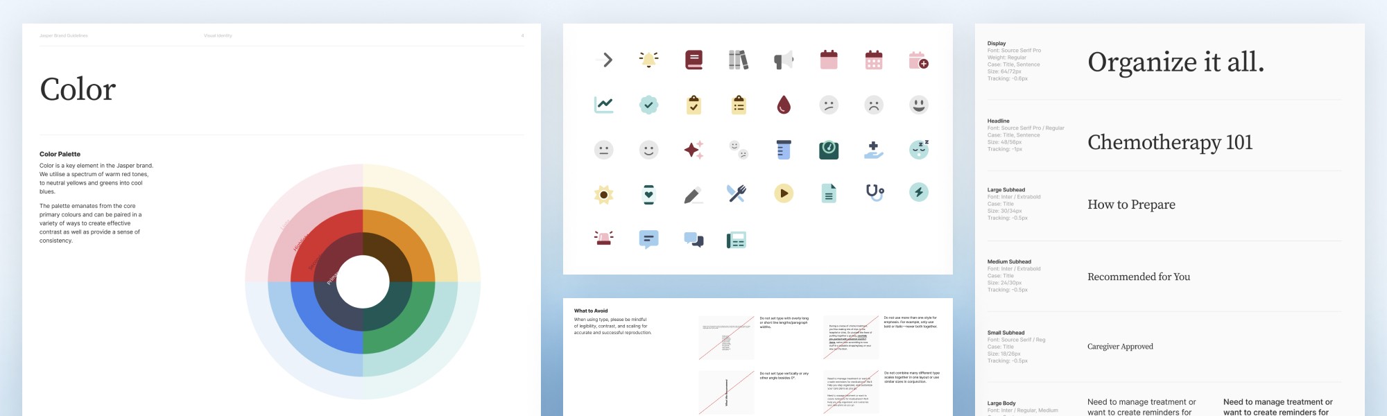
Early on we needed to adjust their design system to provide a broader range of tools. Previous versions leaned a bit heavily on a single colour, which made the experience a little monochromatic. It also leads to more comprehension difficulty by lacking common contrast and colour indicators.
While we wanted to maintain the core of the Jasper identity, we performed revisions on the type scale, palette, icons, and more. The end result is more vibrant and accessible while still maintaining a calm, trusted personality.
Information Architecture revisited
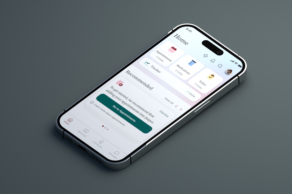
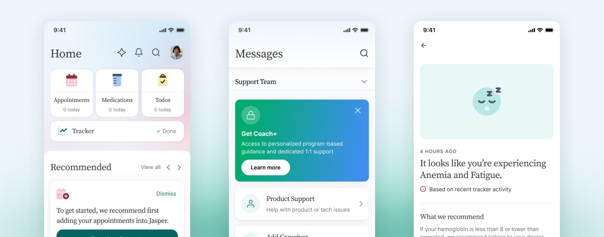
Jasper has many valuable features for different people, but they weren't always discoverable. Some key features had clustered too closely together over time, making some sections heavier than the rest and limiting discoverability.
Through mapping out the journeys against their provided user research, we were able to separate them out to present the options more clearly. This helps reduce feelings of being overwhelmed, which is already difficult considering the toll these people are already under.
Reducing stress through design
Jasper is used by a variety of people who are on their journey with cancer. Whether they've been just diagnosed, deep into treatment, or supporting a loved one with cancer, it's an exhausting situation.
We were tasked with revising the navigation flow and early UX to help ease the early friction.
My Role
I was the Design Lead along with a Principal Designer, Project Manager, and Brand Designer. I was responsible for the design project plan, requirements, and feedback cycles. I also led information architecture work as an individual contributor.
Design System
Early on we needed to adjust their design system to provide a broader range of tools. Previous versions leaned a bit heavily on a single colour, which made the experience a little monochromatic. It also leads to more comprehension difficulty by lacking common contrast and colour indicators.
While we wanted to maintain the core of the Jasper identity, we performed revisions on the type scale, palette, icons, and more. The end result is more vibrant and accessible while still maintaining a calm, trusted personality.
Information Architecture revisited
Jasper has many valuable features for different people, but they weren't always discoverable. Some key features had clustered too closely together over time, making some sections heavier than the rest and limiting discoverability.
Through mapping out the journeys against their provided user research, we were able to separate them out to present the options more clearly. This helps reduce feelings of being overwhelmed, which is already difficult considering the toll these people are already under.